*This post contains affiliate links for your convenience. Thanks for supporting Persia Lou!
Pantone’s 2015 color of the year, Marsala, has been met with some mixed reviews, and I will admit that when I first saw the color, I wasn’t super enthusiastic. But when Valspar and Porch.com (a great site for finding home professionals and DIY inspiration) challenged me to make something using the color of the year, I was definitely excited to give it a try.
I hit Pinterest for some marsala inspiration, and the more I looked the more I was willing to give it a shot.
I decided that Marsala looks particularly good with some texture or sheen – like on a velvet throw pillow or silk drapes (totally luxe). And I liked the way it paired with the more muted pastel-y colors that have been growing in popularity.
I wanted to come up with a color scheme that would bring out the best of Marsala, and I decided to pair it with a pale blush pink and copper:
Oh dear – I love that. Am I selling you on Marsala at all?
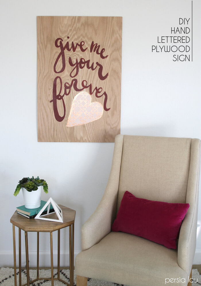
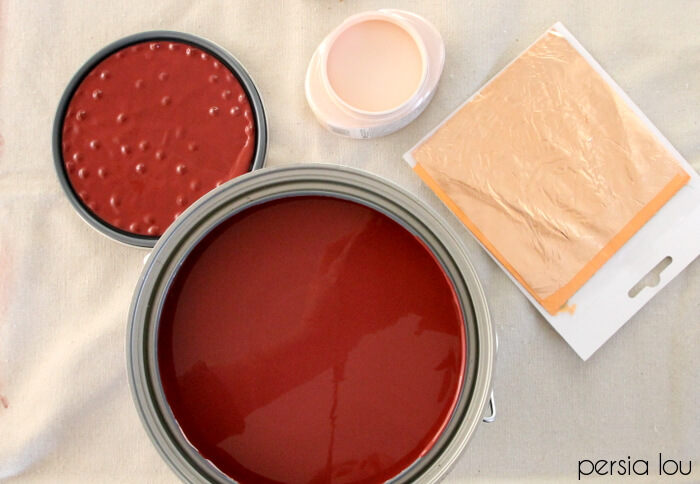
Back to the challenge – Valspar sent me that lovely paint and Porch sent me a stencil to incorporate into the project, and I put them all together to make a big piece of hand-lettered plywood wall art.
Here’s what you need to make your own:
- Plywood
- Paint
- Round Brush
 for lettering
 - Sponge Brush for stenciling
- Stencil (this one is similar)
- Masking tape
- Metal Leaf Adhesive
- Copper Leaf
I picked up a piece of plywood from Lowes and had them cut it down to 3’x2′ for me (I’m not big on the power tools, so I love the free cuts!), and started by sketching out my design on a piece of paper.
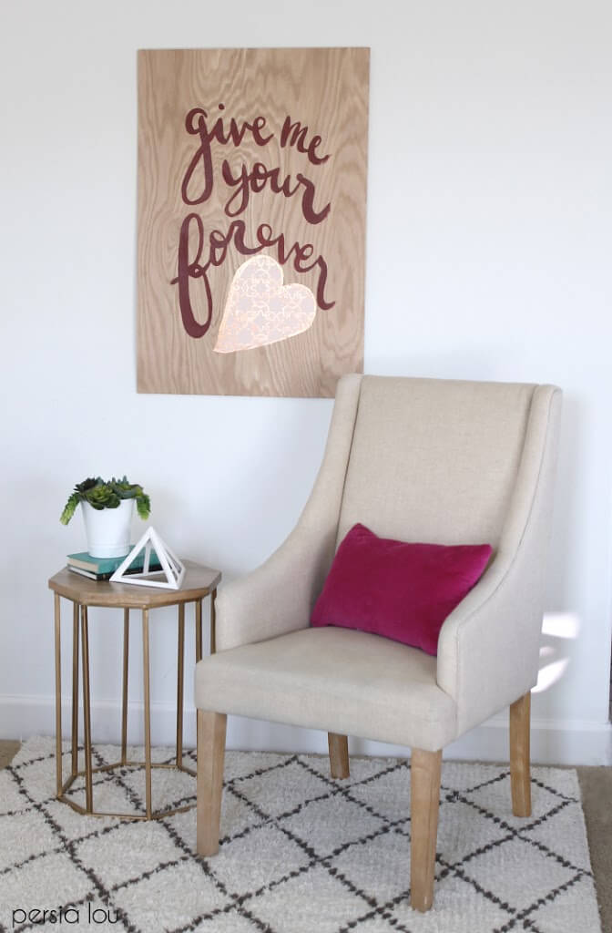
I wanted to do something romantic for this project since it was a kind of Valentine’s Day challenge, so I chose a phrase from our wedding song, “Forever” by Ben Harper.
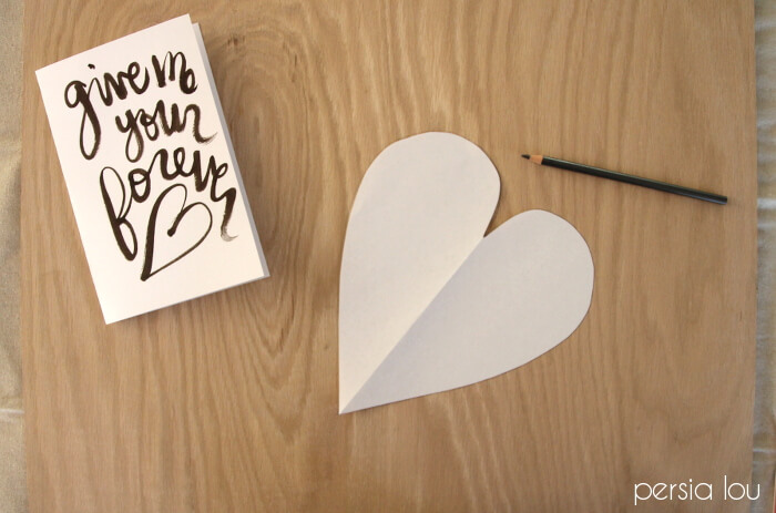
I cut out a paper heart and traced it on the plywood, and then sketched out the phrase around it on the plywood using a pencil. I wasn’t too worried about getting it all perfect, but if you feel less confident in your ability to sketch it out, you could try tracing a projected image or using a technique similar to what I used here.

Next, I painted in my heart with the pale blush color. When that had dried, I painted the text.
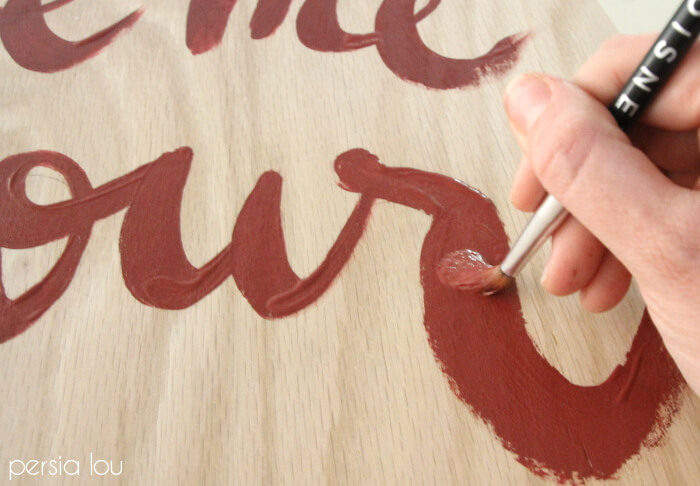
Just a couple of tricks to help you paint your brush script:
- Remember, in general, upstrokes should be thin and downstrokes should be thick.
- You can achieve thick and thing with a brush by holding the brush at a 90 degree angle to the canvas (or plywood in this case). When you use very little pressure (on the upstroke) it give you a fine line, and when you use a lot of pressure it pushed the bristles apart giving you a thicker stroke.
- Don’t overwork it! I think brush script looks best when it is fresh and more natural. It can be hard, but resist the urge to go back and touch everything up. (I don’t always follow my own advice – the “G” and “F” got a bit overworked.)
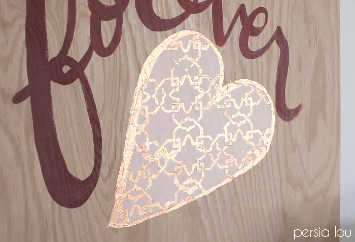
When my lettering was all dry, I added copper leaf to the heart using my stencil.
First, I started by tapping off around the heart to keep the wood around the heart free from adhesive.

Then I taped my stencil down over the top half of the heart. I gently applied the metal leaf adhesive over the stencil using a sponge brush.
When I finished the top half of the heart, I moved the stencil down to the bottom half. Then I used my round brush to paint a border around the outside of the heart.
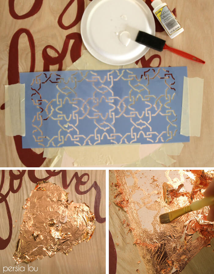
After sitting for about 30 minutes, the metal leaf adhesive was nice and tacky. I covered the heart with sheets of copper leaf, and brushed all the excess away with a clean brush for the big reveal! (Totally my favorite part of any leafing project!)
And my wall art was all done! You can attach hardware to the back for hanging, or I actually used some heavy duty command strips to hang mine.
What do you think? Do you see potential in Marsala? What colors would you pair it with? Tell me all about it in the comments!
Until next time, Happy Making!


Comments + Project Love
The Girl who Loved to Write says
So pretty!!
Amy W says
So cute! And I love that you used copper foil, perfect color complements to the marsala!
Taylor says
I love how you used the stencil! So happy that you're a part of #10daysofValentines! <br />-Taylor & the Porch team
Breanna Bertolini says
I love it Alexis!! I never would have thought to foil the stencil but it's absolutely fabulous 🙂
Brandi says
Love you sign and the way everything is styled. Looks so good!
Erica Sooter says
Oh my goodness. I'm. In. Love. Your hand-lettering is perfection and I love the foil! So beautiful 🙂
Vanessa • Little Gold Pixel says
Very pretty. But re marsala, I can't help but think it's so 1993. I wore a dress that exact color to my freshman homecoming dance! Haha, now I'm just showing my age.
Alexis Middleton says
I totally had a homecoming dress the same color too!
Priya Anand says
Cool Stuff. Interesting to read. <br /><a href="http://www.ljcbuildersandpromoters.com/" rel="nofollow">Builders and Promoters in Chennai</a><br /><br />
Lexi says
Where did you purchase your side table? Love your style!
Lexi says
Where did you purchase your side table? Love your style!
Alexis Middleton says
Thank you! That table was a Target find. I really love it! Check it out here: http://goto.target.com/c/137131/81938/2092?u=http%3A%2F%2Fwww.target.com%2Fp%2Fthreshold-caged-accent-table%2F-%2FA-15842664%23prodSlot%3D_1_5